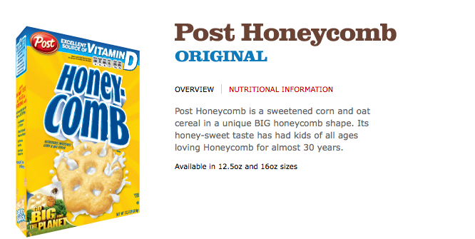
 Since our son has a peanut and soy allergy, I was trying to find the ingredients of Post’s Honeycomb cereal. Shouldn’t be that big of deal, after a quick search I found this page: http://cereals.com/cereals/post_honeycomb/, and that’s where the fun began.
Looks easy enough. There’s a picture of the cereal box, and look! There’s a link for “Nutritional Information”. We’re on our way!


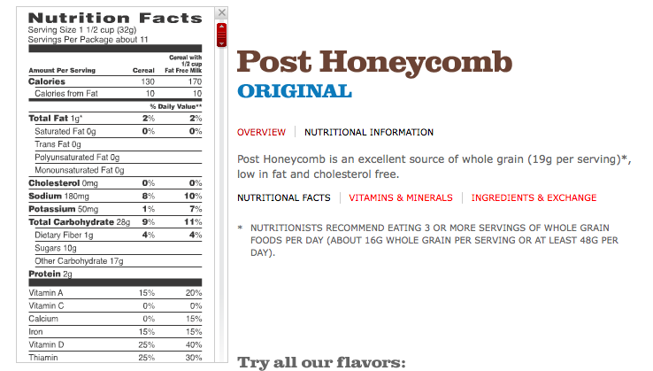
Once you click on “Nutrition Information”, you’re awarded with a really cool graphic of the cereal box swinging around and showing the far side panel. Oooh. Pretty!

Simple enough interface, now I just need to select “Ingredients & Exchange” to find the information I seek. How easy!
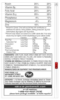
 Choke! After being easily whisked to the information that I was looking for. It’s unusable. Somebody somewhere thought that the flying cereal box would be fun to watch, but apparently it never occurred to the designers or the coders that perhaps somebody might actually want to read the information! Yes, that’s actual size. (warning, nerd-speak: Yes, it’s a PNG and not a lossy .jpg image that you’re looking at.) That’s exactly what every visitor to Post gets to see when they are looking up an ingredient list. Now, I don’t wear glasses and I’m having a horrible time reading it. In all honesty, with adequate squinting, I think I can make out almost all but two of the words. I hate to think what someone with less than perfect vision would be experiencing at this point.
Post spent a lot of money for this user experience (which I assume they applied to every other item on their web site) and it’s completely worthless as this breaks the number one rule of web design: Don’t annoy your visitors!


